Infographics are great pieces of content. Portraying data sets in an easily consumed way is useful for a few reasons:
- Such content is very likely to be shared across the social media – brand awareness
- There are lots of sites that would give a link back for a decent infographic – SEO value
- Such pieces can be used to drive the interest to your product – market creation
The thing is, infographics only work if you can actually deliver something of a high quality. This is a rarity in the FX industry.
Vantage FX Infographic
What’s wrong with it?
There is quite some place for improvement, but I will focus only on the 3 most important items.
1. Lack of value
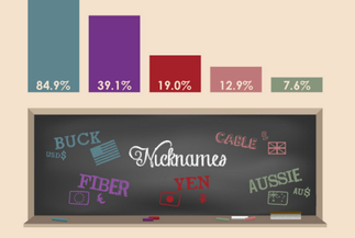
What does this infographic tells us? After providing a quick geography lesson it simply tells us that a few currencies are traded quite a lot.
If you have no clue about the FX market and you don’t know that the currencies are traded in pairs – you would get quite puzzled. Top5 mostly traded currencies account for 163.5%…
2. Poor design
The blackboard with nicknames is just a masterpiece and a piece chart looks straight out of excel. There is also a lack of consistency when it comes to colour usage.
Firstly tile is used to describe the largest variable, then it is used to point one of the smallest.
3. No CTA
Even though it is not always a good idea to call for some action at the infographic, for basic FX data it could be beneficial to offer at least a free demo account.
What’s the action item here?
Think about the last time your broker released some content that was shared by more than 25 people, excluding your team members of course. Can’t recall? Then it might be just a proper time to design an infographic. But before you do that, take a look at a masterpiece above and make sure your work will be shared, but not as a bad example.